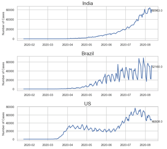
I have found that using a For Loop to create a series of subplots allows for greater flexibility to customize the individual plots compared to using the Pandas plot function. In this post, I’ll show you how to use a For Loop to create individual subplots and axes variables from a single Pandas DataFrame.
There are multiple ways to create a series of subplots from a Pandas DataFrame. One of which is to use the Pandas df.plot() function and passing in subplots = True argument. It’s a quick way to accomplish the goal of creating subplots, however, the ability to customize an individual subplot is lost.
By looping through the DataFrame and creating individual subplot axis variables along the way, we can implement custom formatting for each or all the subplots. One of my favorite customizations is to add a data label to the most recent point in the chart using ax.annotate().
For this post, I am using the publically available COVID-19 data sets. Check out my post on Analyzing COVID-19 Data in Python to see how to access them.
Here are the steps at a high level:
- Start with a DataFrame in a long format (so opposite of a pivot table). You may need to leverage the
pd.melt()to unpivot your data - Create a list of items used to filter the DataFrame
- Dynamically adjust the figure size to accommodate the number of subplots
- Create a For Loop that creates an axis object for each filtered category
Start with a DataFrame in Long Format
This means your data is long. In the example below, there are two category columns and one numerical column. New data points would add more rows to the dataset.

Create a List to Filter the DataFrame
The next step is to make a list of the categories to filter. In my example, I am going to make a list of unique country names. In the loop, I will create a new DataFrame based on each item in the list.
One way to accomplish this would be to run this on the category column: df['Countries'].unique.tolist()
Please note that the order of the list is the order of how the subplots will appear.
Dynamic Figure Size
I find that a fig size with a height of 3.5 subplot works pretty well for each subplot. Multiplying 3.5 by the number of items in your list, using len(lst) allows the figure size to be dynamic. This is great if you change the data set or if you use the code for a different project.
Create Individual Axes Variables for each DataFrame Category
To start, grab the index value of the list item with ind = df.index(i)
Next, filter the DataFrame for the first item in the list. Then, assign and plot the filtered DataFrame to an axis variable. By calling the index value in the brackets, the axis variable becomes dynamic.
Lastly, add any other customizations to the subplot by calling the axis variables. In my example below, I am setting a y-label that is the same for each subplot, but I am applying a custom annotation to each subplot. I can call out the most recent data point and create a data label for each.
countries_list_top_20 = countries_list[:20]
fig, ax = plt.subplots(nrows=len(countries_list_top_20), figsize=(12,len(countries_list_top_20)*3.5)) #dynamically set the figure size from the number of subplots. I find that 3.5 is a good height per subplot to see the data

for i in countries_list_top_20:
    ind = countries_list_top_20.index(i) #a trick to get a list of 0 to whatever
    filt = df_country_with_cases['Country/Region'] == i #filter the dataframe for each item in the list

    ax[ind].plot(df_country_with_cases.loc[filt]['Date'],df_country_with_cases.loc[filt]['Number of Cases']) #plotting the filtered dataframe. The brackets make the axis variable dynamic

    ax[ind].set_title(i, size=25) #here I am setting the title of each subplot to be the category
    ax[ind].set_ylabel('Number of Cases', size=15) #setting the ylabel and font size
    ax[ind].xaxis.set_tick_params(labelsize=15) #setting the font size of the x axis
    ax[ind].yaxis.set_tick_params(labelsize=15) #setting the font size of the y axis

    #Optionally add data labels or text to the subplots
    cases_yesterday_filter = (df_country_with_cases['Date'] == df_country_with_cases['Date'].max()) & (df_country_with_cases['Country/Region'] == i) #filter to find the latest data point for the respective country
    cases_yesterday = df_country_with_cases.loc[cases_yesterday_filter].iloc[0]['Number of Cases'] #applying the filter to the dataframe
    ax[ind].annotate(str(cases_yesterday), xy=(df_country_with_cases['Date'].max(),cases_yesterday),xycoords = 'data', ha ='left', va='top', fontsize =15) #adding the datapoint to the subplot

plt.tight_layout()
There are a ton of customizations you can do and I tried to boil it down to the essentials. Leave a comment below if you have any questions!
