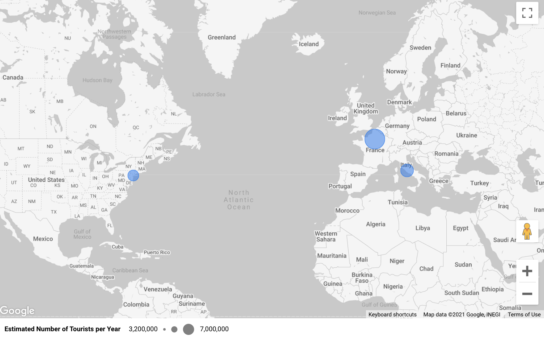
Google Data Studio makes it so easy to take address data and convert it into an interactive map.
Final Output
Why Google Data Studio?
- Easily connect data from a Google Sheet
- Slick Google maps integration
- It’s free
Setting up your data
It’s best to have your data in longitude and latitude to ensure consistent data across your dataset. If you only have the address or a place name, then please see this post – How to Return the Complete Address Information from a Place Name or Partial Address in Python. One thing to note is that if you are a Salesforce user, then latitude and longitude should already be calculated for you a standard field.
The final format we are working on is a data point that is formatted like this: latitude,longitude. A properly formatted point will look like this: 40.6893632721971,-74.0445004017749
Add your Data Source
The easiest way to get started would be to create a Google Sheet with your data. You can check out this Google Sheet that has the source data for my chart.
Once your data is ready, you can then add a Data Source in Google Data Studio. After you sign in, click Create > Data source

Next, click Google Sheet (or a different data source if applicable). Navigate to your specific Worksheet within your Spreadsheet and then click Connect.

Creating the Geo Data Type Field
We have to now convert the latitude and longitude fields into a Geo-Spatial field so that Google Data Studio can correctly plot the data.
Navigate to your Data Sources and click on the data source we just created. Then click Add a Field.

The formula to create the field is this: CONCAT(CAST(Latitude AS TEXT),",",CAST(Longitude AS TEXT))
You’ll need to replace Latitude and Longitude with the field names you are using.

Finally, you need to change the formatting of the field from Text to Latitude, Longitude.


Plotting
Now you are ready to make the chart! From the Google Studio home page, you can click Create > Report.
Click Add Data and choose from an Existing Source (since we already added the data source earlier).
In my example, I am using the Google Maps Bubble Chart.
Your chart setup should look something like the screenshot below. The key thing is to have the Latitude and Longitude custom field we created in the Location section.

You can check out the final report here.
Final Thoughts
Check out more Python tricks in this Colab Notebook or in my recent Python Posts.
Thanks for reading!
