Data Analytics Simplified
Automate Smarter. Scale Faster.
Welcome to Data Analytics Simplified, a blog dedicated to helping you streamline data workflows, automate processes, and scale your infrastructure—without the headaches. Whether you’re battling messy spreadsheets, inefficient pipelines, or trying to get the most out of your data analytics investments, you’re in the right place.
Why You’re Here:
- Your Data Outgrew Your Infrastructure: Your setup worked for a while, but now it’s bursting at the seams. It’s time to upgrade, streamline, or rebuild entirely.
- Your Analytics Aren’t Delivering: You’ve invested in analytics tools and tech, but the results are underwhelming. You need insights, not excuses.
- You’re New to the World of Data: You’re navigating the complexities of data engineering for the first time and need practical, actionable advice to get started.
What You’ll Get:
I’ll share proven strategies, tips, and frameworks from my experience in data engineering and analytics, focusing on:
- Automation: Save time and reduce errors with automated workflows and processes.
- Operational Efficiency: Improve the scalability and reliability of your data infrastructure.
- Practical Problem-Solving: Explore innovative tools and technologies that get the job done efficiently and cost-effectively, without the need for overly complex or tailored solutions.
Data doesn’t have to be overwhelming. With the right approach, you can declutter, optimize, and build a solid foundation for data science and analytics.
Let’s get to work.
Recent Posts
-
How to Compare Two Python Lists and Return Items that Appear in Both Lists
In this post, I’ll show you how to return the common list items between two lists in Python.
-
How to Return the Most Recent Files from a Directory with Python
Using the glob library, we can quickly and dynamically pull a list of files from any directory and loop through them.
-

Leverage Plotly Express + Bootstrap to Create Great Looking HTML Reports
You’ve just finished a stellar analysis in a Jupyter notebook and you are ready to share your work with colleagues. However, they’ve never heard of a Jupyter notebook. In this post, I’ll walk you through creating an HTML export that leverages Bootstrap to create a styled exportable report from a Jupyter notebook.
-
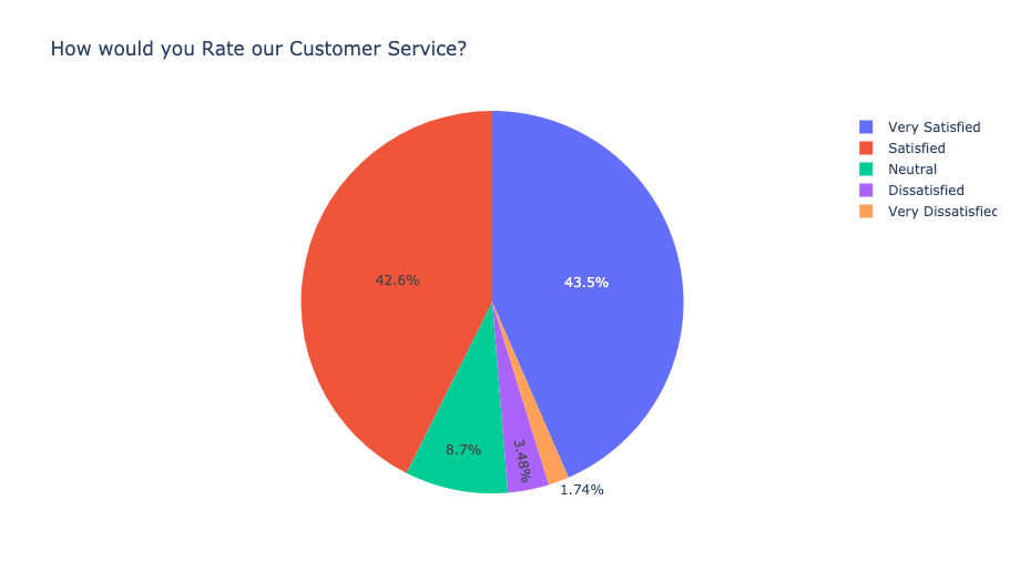
Are Pie Charts Always a Bad Choice?
Most of the time, yes. In this post, I’ll explain why there is usually a better chart to choose from than a pie chart and visualization techniques for categorical data.
-
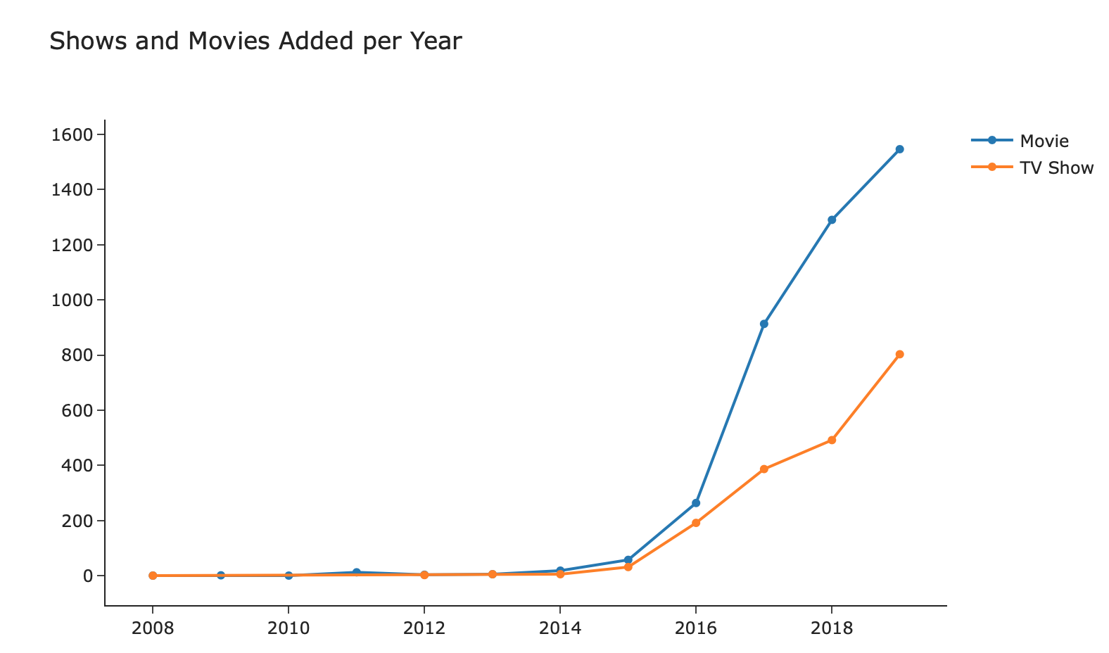
Analyzing Netflix Movies and TV Shows
An analysis of the shows and movies in Netflix as of 2019 using a dataset from Kaggle.
-
How to Break up a Comma Separated String in a Pandas Column
Let’s say you have a column of data that is a string list separated by commas. In this post, I’ll walk you through two ways to break up the data and count the frequency of the list items.
-
Is your Data Highly Skewed? Try Visualizing with using a Log Scale
Visualizing data that is highly skewed is tricky because most points get overshadowed. To fix that, try using a log scale.
-
How to Custom Sort a Python String List
If you have a list of string items and you want to perform a custom sort order (ie not alphabetical), you can use the key parameter in the list.sort() method to define the order.
-

Analyzing 2020 Election Results
An analysis of the 2020 presidential votes by county and voter turnout by state using datasets from Kaggle.