Data Analytics Simplified
Automate Smarter. Scale Faster.
Welcome to Data Analytics Simplified, a blog dedicated to helping you streamline data workflows, automate processes, and scale your infrastructure—without the headaches. Whether you’re battling messy spreadsheets, inefficient pipelines, or trying to get the most out of your data analytics investments, you’re in the right place.
Why You’re Here:
- Your Data Outgrew Your Infrastructure: Your setup worked for a while, but now it’s bursting at the seams. It’s time to upgrade, streamline, or rebuild entirely.
- Your Analytics Aren’t Delivering: You’ve invested in analytics tools and tech, but the results are underwhelming. You need insights, not excuses.
- You’re New to the World of Data: You’re navigating the complexities of data engineering for the first time and need practical, actionable advice to get started.
What You’ll Get:
I’ll share proven strategies, tips, and frameworks from my experience in data engineering and analytics, focusing on:
- Automation: Save time and reduce errors with automated workflows and processes.
- Operational Efficiency: Improve the scalability and reliability of your data infrastructure.
- Practical Problem-Solving: Explore innovative tools and technologies that get the job done efficiently and cost-effectively, without the need for overly complex or tailored solutions.
Data doesn’t have to be overwhelming. With the right approach, you can declutter, optimize, and build a solid foundation for data science and analytics.
Let’s get to work.
Recent Posts
-
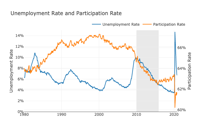
The Pandemic Recovery
In this post, I’ll be looking at a few indicators economic to measure the economic recovery from COVID-19. This was inspired by the Daily Podcast on November 19th, 2020 – The Pandemic Economy in 7 Numbers. I’ll be using data from FRED for this project and analyzing the data in a Jupyter Notebook.
-
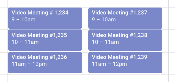
How Much Time Do you Spend in Meetings?
In this post, I’ll analyze my Google Calendar events to see exactly how much time I spend in meetings each week.
-
Analyzing COVID-19 Data
I’ll be analyzing COVID-19 data in a Jupyter Notebook for this post.
-

How I use Salesforce as a Simple Campaign Outreach Tool
The Salesforce Campaign object is a great way to bucket contacts for mass outreach. However, there are limited ways to actually getting contacts assigned to a campaign. In this project, I’ll discuss the Salesforce limitations and how I can get around them using the Salesforce API and Python.
-
How to Analyze more than 1,048,576 Rows of Data in Excel
Excel has a limit of 1,048,576 rows and 16,384 columns. Here are a few options to explore if your data exceeds those limitations.
-
COVID-19 Dashboard
This dashboard is using data from the COVID Tracking Project. The dashboard is built using Python and Flask. The visualizations are made using Plotly and the Dash framework. The app is hosted on AWS Beanstalk.
-
How to Check for NaN Values when Applying a Function on a DataFrame
Nan values in a Pandas DataFrame can be tricky to work with. In this post, I’ll show you how to correctly account for them when writing a function with conditionals.
-
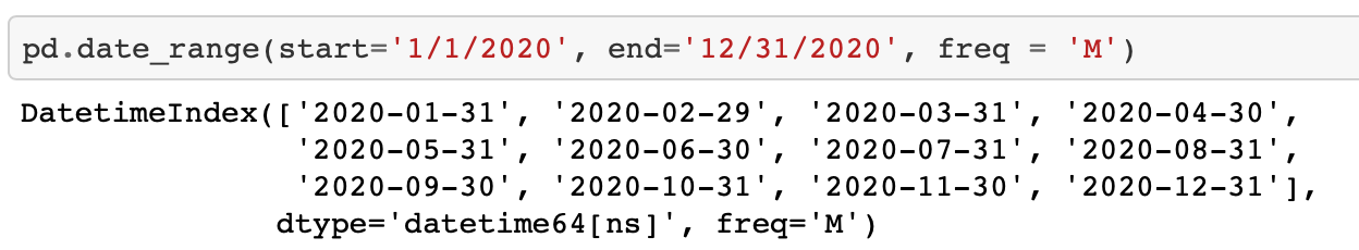
How to Quickly and Easily get a List of Week-end, Month-end, or Year-end Dates in Python
Getting month-end, or any other interval can be cumbersome. In this post, I’ll show you how to generate a list of dates quickly in Python.
-
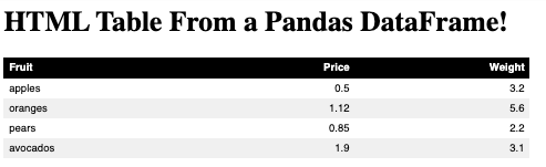
How to Export a Pandas DataFrame to an HTML Table and Add Custom Styling or CSS Classes
Using the built-in Pandas function to export a DataFrame to an HTML table is quick way to export your DataFrame but it does has some limitations. Using a for loop to create your HTML table allows you to add any custom styling or CSS classes for enhanced formatting. In this post, I’ll walk you through…